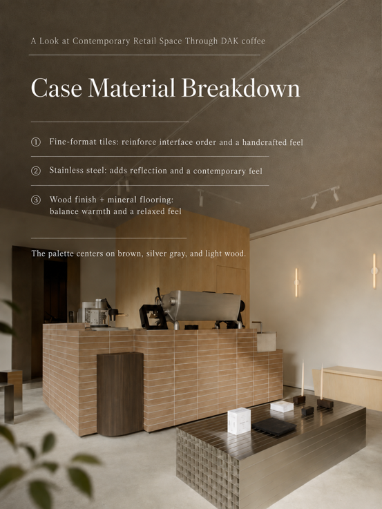

In today’s commercial space design, the most easily overlooked element is often a wall. In the past, walls primarily served as “background”: Supporting lighting, showcasing products, complementing furniture. But today, more and more designers are rethinking: Can a wall become the most memorable element of a space?
From boutique cafés and independent restaurants to concept stores and boutique hotels, commercial spaces are shifting from “decorated spaces” to “emotional experience spaces.” What consumers remember is not necessarily a table or a lamp, but perhaps a wall that has color, texture, and a story. And “small tile color-blocking” is becoming one of the most eye-catching design expressions in today’s commercial spaces.
What Designers Really Need Is Not a Single Tile, but a Complete Spatial Expression System
In many projects, selecting materials is not difficult. What is truly difficult is: How to make materials generate design value?
The same wall: A single-color installation may simply complete construction; A combination of small tiles in different colors can form a spatial language. Because color itself carries emotion: Beige represents warmth and nature; Terracotta represents time and craftsmanship; Gray-brown represents stability and architectural sense; Black-gray represents order and sophistication.
When these colors are combined in proportional relationships, the wall is no longer just decoration — it becomes the visual center of the space. This is also the direction Shuangou has been researching: Materials are not the end of a space, but the beginning of design expression.
Why Is Small Tile Color-Blocking Becoming a New Trend in Commercial Spaces
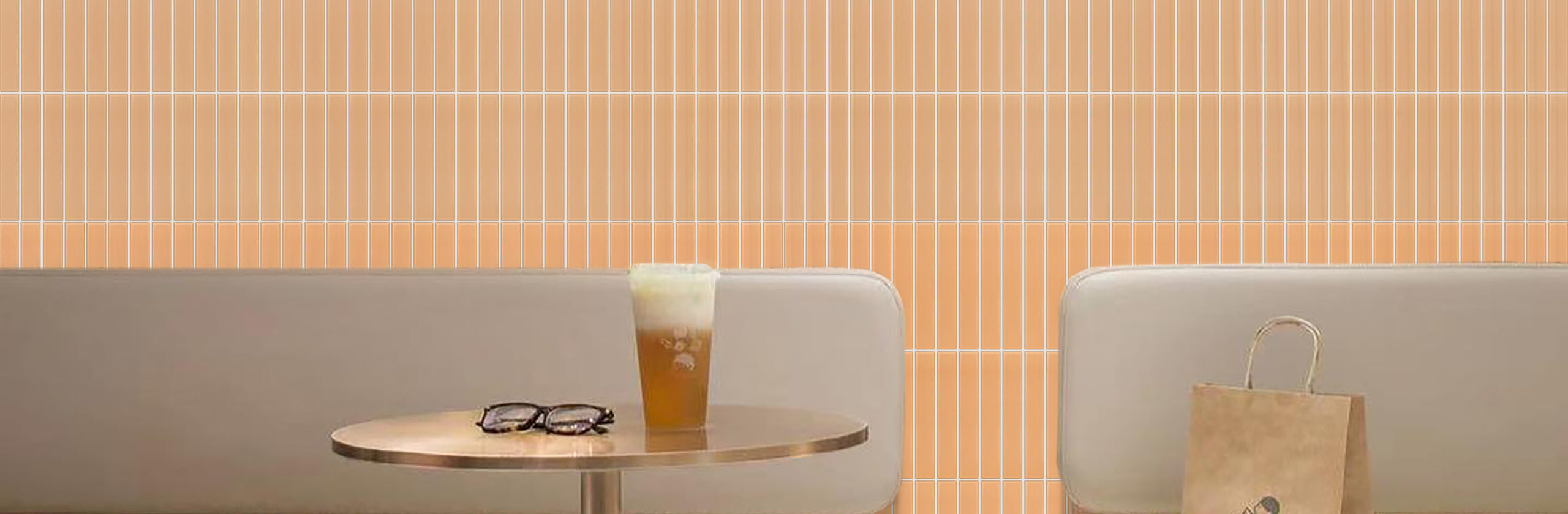
Compared to large-format materials, the biggest advantage of small-format tiles: Is their stronger design participation. The 50×200mm small tile proportion itself carries the scale of classic architectural materials.
It can create rich spatial layers through:Color variation; Installation patterns; Joint rhythm; Light and shadow changes. In commercial spaces especially, small tiles can solve a key problem: How to give a brand a unique visual memory.
For example: A café that simply uses white walls and wooden furniture is easily replicated. But if it has: A small tile wall in a gradient from white to apricot, Or: A feature wall mixing terracotta and dark coffee tones, It will form a visual symbol unique to the brand.
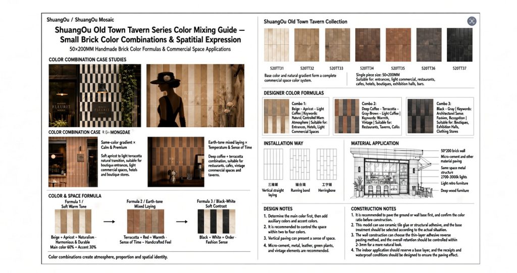
The Shuangou Old Town Tavern Series, based on the classic 50×200mm small tile proportion, has established a natural color system:
520TT31 Cream White; 520TT32 Light Coffee; 520TT33 Terracotta Gray; 520TT34 Warm Brown; 520TT35 Terracotta Brown; 520TT36 Deep Gray; 520TT37 Black Gray. These colors do not exist in isolation. What designers can truly leverage is: The relationships between colors.
Cream White × Apricot × Light Coffee
Creating a Naturally Warm Commercial Space. Suitable for: Boutique Cafés; Light Dining Restaurants; Guesthouse; Public Spaces. This is the easiest combination to create a sense of sophistication. Light colors form a soft transition: No strong conflicts, Yet layers emerge through subtle variations.
Spatial feel: Like an old wall after sunlight exposure, Natural, quiet, with a lived-in feel. This combination aligns perfectly with the current trend of: Contemporary naturalist commercial spaces.
Terracotta Brown × Burnt Terracotta × Gray-Brown
Giving the Space a Sense of Time. Suitable for: Restaurants; Taverns; Vintage Concept Stores. Terracotta naturally carries humanistic qualities. It liberates the space from industrialized renovation feel. Adding gray-brown softens the heaviness of the color, making the overall effect more restrained.
Final presentation: A sense of age reminiscent of old street buildings, handcrafted pottery, and old taverns. This is why more and more F&B brands are drawn to: Spaces that “look like they’ve been marked by time.”
Black-Gray × Deep Gray × Cream White Accents
Creating Sophisticated Visual Focal Points with Color Contrast. Suitable for: Menswear Stores; Boutique Hotels; Trend-Driven Commercial Spaces. Black and gray establish spatial presence, Cream white serves as visual buffer, Preventing the space from becoming too stark.
Through light-and-dark variation, the wall takes on rich layers reminiscent of natural stone. The core of this combination: Not creating strong conflict, But creating visual memory.
Many designers worry: Will mixing colors be too chaotic? In reality, sophisticated color mixing is never random. Shuangou recommends: First: Control the Number of Colors. For commercial spaces: 2-3 colors is the optimal combination. Fewer colors make sophistication easier. Recommended proportions: Primary color 60%; Secondary color 30%; Accent color 10%; Give the wall visual order.
Different areas need different emotions:
Entrance/Storefront: Needs recognizability — appropriate color contrast can be strengthened.
Bar/Counter Backdrop: Needs to be a visual center — increase light-and-dark variation.
Large Wall Areas: Recommended gradient color mixing to avoid visual fatigue.
Future commercial design is not just about “good looks.”
What’s more important is: Whether the space is remembered. Why can consumers instantly recognize international brand stores even in different cities? Because they have established a stable: Color system; Material language; Spatial emotion.
Shuangou believes: What designers truly need is not just more material choices, But material solutions that help them complete spatial expression. That’s why Shuangou continuously follows global spatial trends — from material R&D to color coordination to real-world application, Helping designers find: The method to make an ordinary wall memorable. Because a wall, Can also become a brand’s most valuable visual asset.
50×200mm Small Tile Color System. Small tile color-blocking is more than just an installation method. It is becoming a new language for creating identity in commercial spaces.