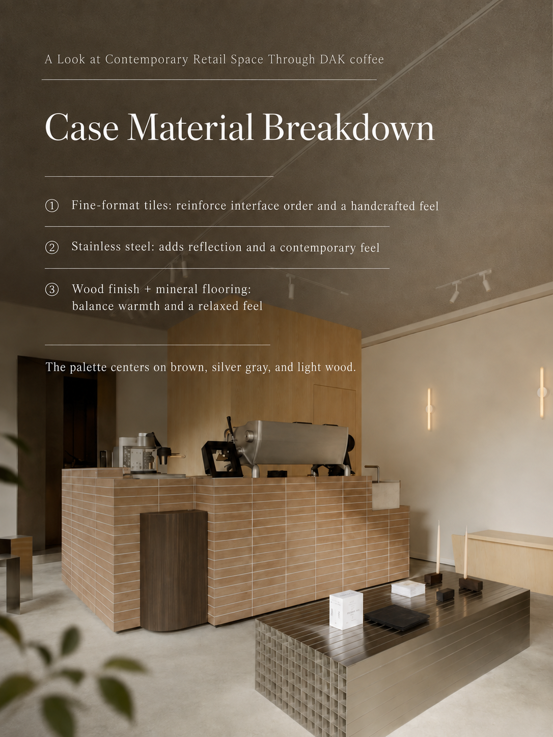

In contemporary commercial space design, truly sophisticated spaces are reducing the “sense of deliberate design” and instead focusing on the emotional value brought by materials themselves. A café, a lifestyle space — it’s not just about carrying consumption functions, but becoming a third space connecting people and the city.
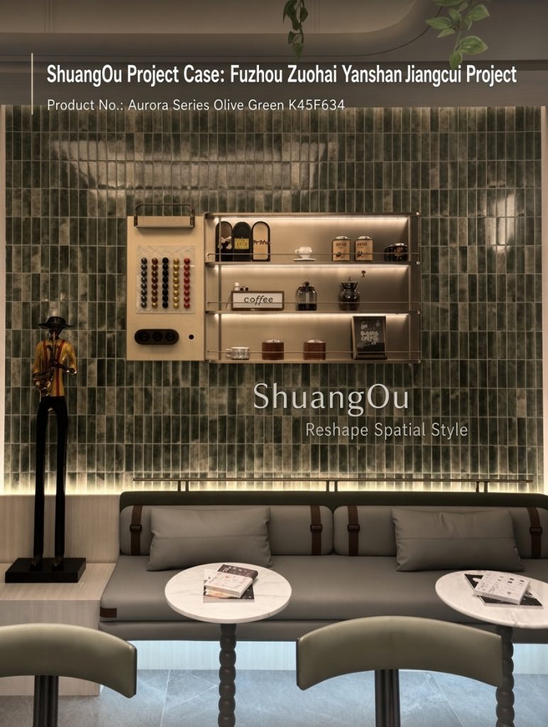
The Fuzhou Zuohai Yanshan Jiangcui project is an exploration of the fusion of color, material, and spatial atmosphere. The project chose Shuangou Mosaic Aurora Series as the core wall material, using the gloss variations of green glazed tiles, small-format arrangement, and natural color expression to give the space a quiet, natural, and vibrant commercial character. This wall is not just a backdrop. It becomes the emotional entry point of the entire space.
Commercial Space Trends: From “Visual Design” to “Material Design Era”
In the past, commercial spaces sought to create talking points through exaggerated forms: Giant installations, intense colors, complex structures. But in recent years, high-end commercial design has been changing. More and more boutique cafés, hotels, public areas, and lifestyle brands are focusing on: Whether the space makes people want to stay.
What consumers truly remember is not necessarily a complex form, but a texture, a play of light and shadow, an emotion brought by a color. Therefore, commercial space design is shifting from: “Creating a beautiful space” To: “Creating a perceptible spatial experience.” Materials are becoming an important language of brand expression.
Zuohai Yanshan Jiangcui Project: Using Shuangou Aurora Series to Create the Spatial Visual Core
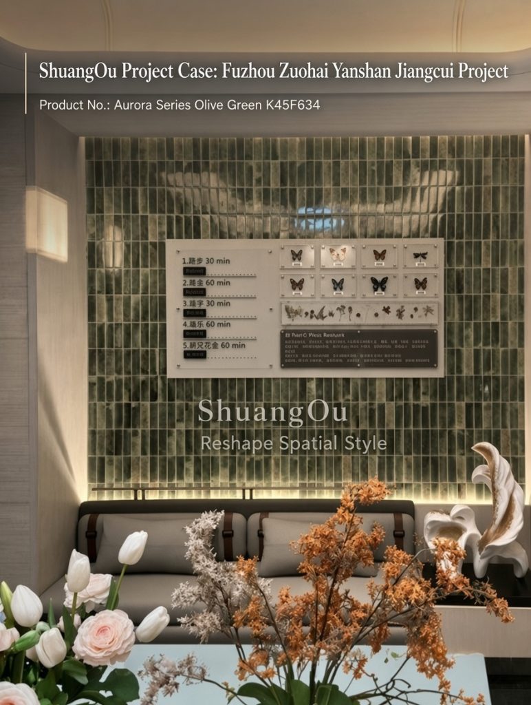
In the Fuzhou Zuohai Yanshan Jiangcui project, the designer chose the Shuangou Aurora Series as the core wall material. Unlike ordinary wall decoration materials, the Aurora Series, through its delicate glazed texture and naturally varying green layers, gives the wall a richer visual expression.
After large-area installation: From a distance, it’s a whole wall of serene, natural green backdrop; Up close, you can feel the subtle color variations and gloss flow between each tile.
This “small-scale, high-texture” material expression aligns perfectly with what contemporary commercial spaces pursue: Restrained, sophisticated, enduringly appealing. It doesn’t steal the show, yet continuously elevates the spatial quality.
Why Are More and More Commercial Spaces Drawn to Green Materials
Green is becoming an important trend in commercial spaces in recent years. But truly sophisticated green is not a high-saturation visual stimulus — it comes from nature: Forests, moss, plants, minerals.
The Aurora Series green in the Zuohai Yanshan Jiangcui project, through low-saturation color, creates a natural healing sensation in the space. Paired with soft lighting, clean furniture, and plant elements, the entire space presents: A quiet natural feel; A warm sense of belonging; A sophisticated lifestyle ambiance.
This color language is especially suited for: Boutique Coffee Spaces; Lifestyle Concept Stores; High-End Dining; Boutique Hotel Public Areas; Cultural Exhibition Spaces. Because it not only satisfies visual aesthetics, but also influences the emotional experience of consumers upon entering the space.
Small-Format Tiles Are Becoming a New Design Language for Commercial Spaces
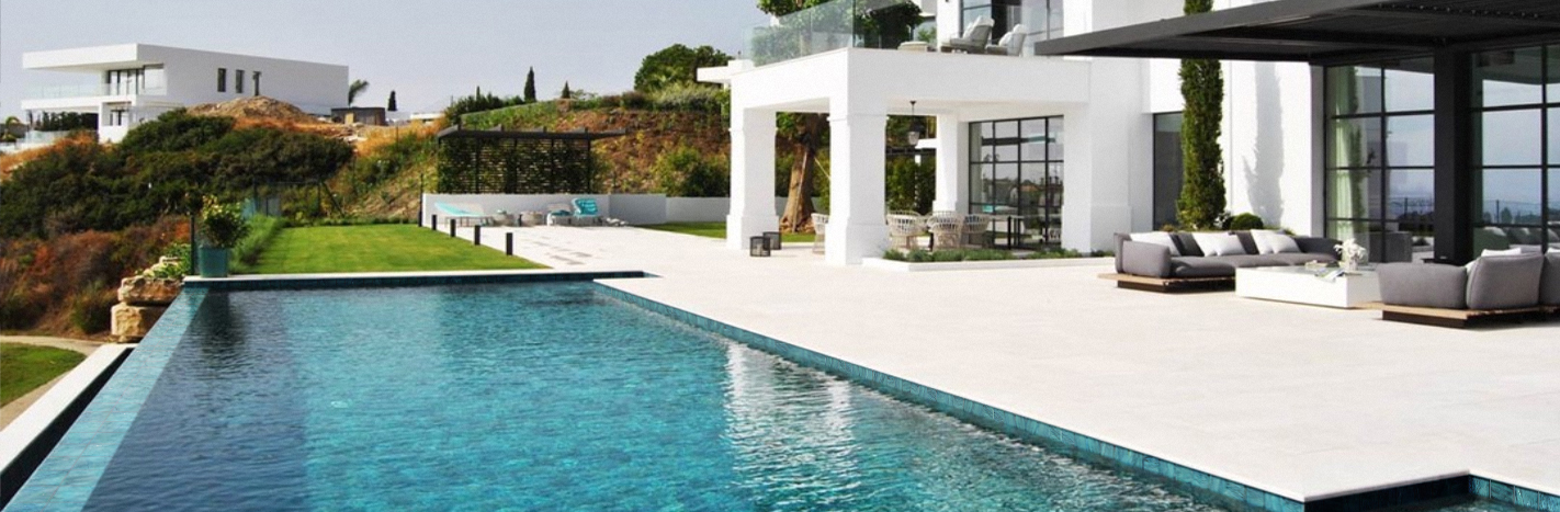
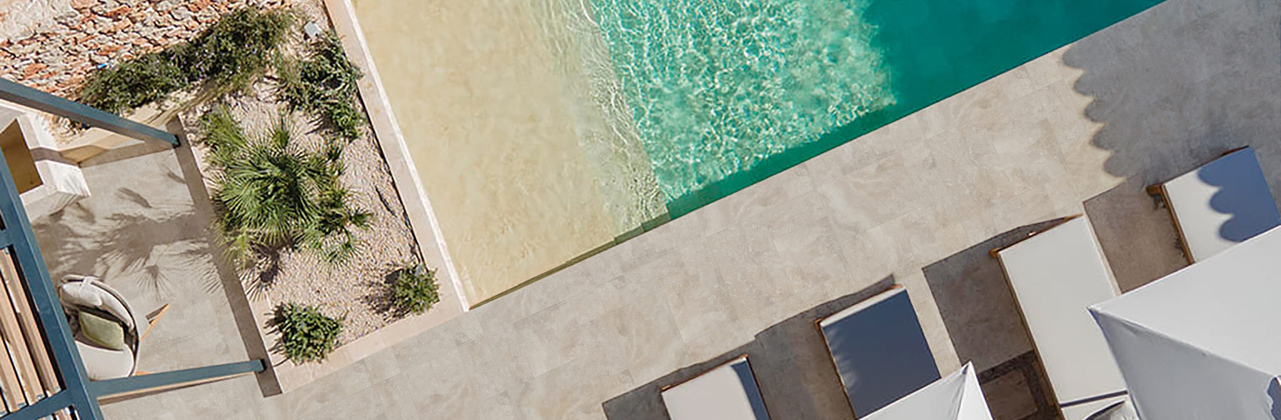
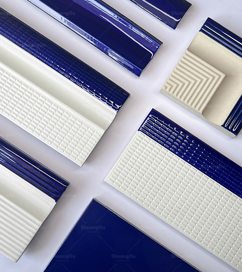
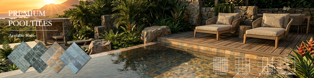
In the past, mosaics were mostly used in swimming pools and water features. But as commercial space aesthetics evolve, small-format tiles are breaking through traditional boundaries.
Designers are beginning to use them to create:
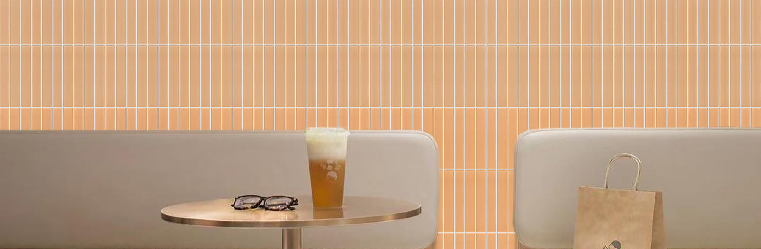
- Wall Memory Points: Forming brand visual symbols through repetitive arrangement.
- Bar Counter Backdrops: Using fine textures to enhance spatial refinement.
- Display Areas: Elevating display layers through material variation.
- Local Spaces: Creating an experiential feel that sets them apart from ordinary commercial spaces.
It is under this trend that the Shuangou Aurora Series transforms small-format tiles from “functional materials” into “spatial design materials.”
Shuangou Aurora Series: From Material Selection to Spatial Coordination Execution
For designers, choosing a tile is not just about choosing a color. More importantly: How it forms relationships with other materials in the space.
In the Zuohai Yanshan Jiangcui project, Shuangou carried out spatial coordination thinking around the material characteristics of the Aurora Series:
- Color Relationships: The green wall as the spatial visual core forms a soft contrast with warm lighting, making the space feel warmer.
- Material Relationships: The delicate gloss of glazed tiles creates rich layers with wood, metal, and soft furnishings.
- Spatial Relationships: Using small-format tile arrangement to create a sense of order, making the wall an architectural language within the space.
This is also the direction Shuangou has always pursued: Not just providing a material, but studying how materials enter a space and how they help design truly come to life.
Future Commercial Spaces: Materials Are Brand Memory
In the future, outstanding commercial spaces won’t necessarily rely on complex designs to attract consumers. They may only need: A textured wall; A unique material language; A color that can be remembered. The Shuangou Aurora Series in the Fuzhou Zuohai Yanshan Jiangcui project is a practice of material-space integration. It makes a wall the carrier of spatial emotion, and makes materials part of the brand experience.