

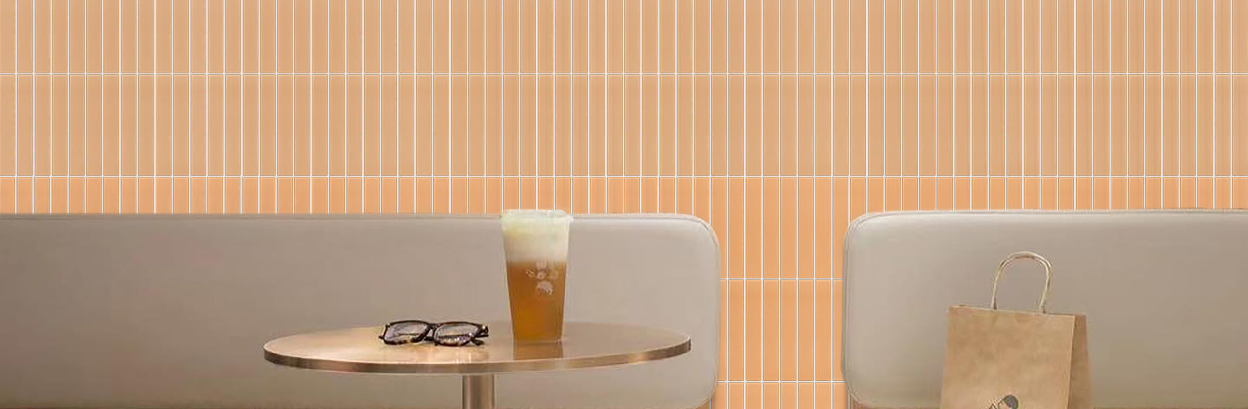
More and more specialty coffee shops are reducing complex forms and handing the design focus back to materials. DAK coffee in the Netherlands is a very typical example. There is not much decoration in the space. What truly creates a memorable impression is the combination of warm brown slim strip tiles, light wood, silver-gray metal, and a gray floor. The number of materials seems limited, yet the space feels more complete than many interiors “filled with design elements.” The key behind this is not a particular style, but the scale, texture, and hierarchy of the materials.
Why are coffee shops today becoming more and more fond of small-format tiles?
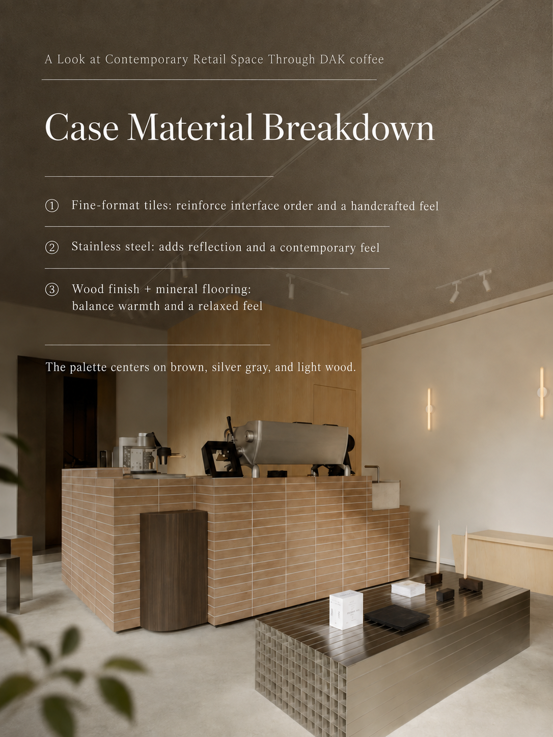
Large-format materials can create clean, continuous surfaces more easily, while the advantage of small-format tiles is that they add a finer sense of scale to the space. DAK coffee’s counter is a good example. The slender tiles repeat continuously, and the grout joints naturally create rhythm, breaking down the visual mass of the relatively large counter into something more delicate. Combined with subtle variations in color and surface texture, the result does not feel overly flat or industrial when viewed up close.
This is also a material direction worth watching in commercial spaces in recent years: As spaces become more restrained, the materials themselves are asked to carry more of the design expression. Especially in coffee shops, restaurants, and buyer stores where customers engage with the space at close range, the tactile quality and details brought by small-format materials are more likely to create memorable impressions than a single large background surface.
Why can’t the “refined feel” of a coffee shop rely on just one material?
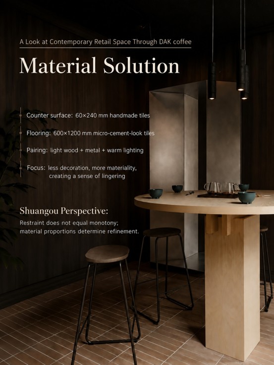
Another point worth learning from DAK coffee is that it does not pursue complete uniformity across all materials. The warm brown small tiles are warm; the silver-gray metal is calm; the light wood brings natural grain; and the gray floor intentionally lowers its presence.
There is even obvious contrast between the materials. Yet it is exactly this relationship between warmth and coolness, roughness and smoothness, absorbent surfaces and reflective surfaces that gives the space depth. So when designing commercial spaces, material coordination does not have to mean “everything in the same color.” More important than uniformity is deciding who is the lead and who is the background.
How can this kind of overseas coffee-shop look be implemented in China?
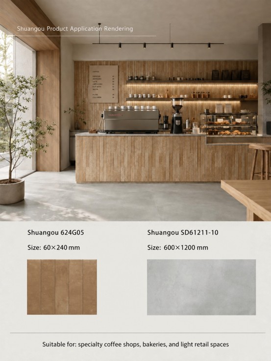
For designers, after seeing overseas case studies, the truly difficult step is usually not “which style do I like?” but this: What size, what color, and what kind of texture should I source in China? For DAK coffee’s material logic, the Chinese material combination proposed by Shuangou is: Counter and key vertical surfaces: Shuangou 520LM15 | 50×200 mm. The slender 50×200 mm proportion is suitable for counters, half walls, storefront façades, and key background surfaces, creating a finer visual rhythm through continuous installation. Flooring: Shuangou SD61211-10 | 600×1200 mm. Use a low-saturation gray-toned large-format material so that the floor visually steps back and does not compete with the counter for attention. Paired with light wood finishes, brushed or silver-gray metal, and warm lighting, this can establish a material relationship similar to that of this kind of European specialty coffee space.
There is also a design detail that is easy to overlook: Once the materials are enough, stop adding more. The small tiles already provide scale and texture, wood provides warmth, and metal provides reflection. If you then add complex stone veining, patterned walls, and a large amount of decoration, the originally clean material relationship is easily disrupted. What is truly worth learning from overseas case studies is not “looking exactly the same.” When Shuangou creates its “Global Space Implementation Plan,” the goal is not to copy overseas spaces into China.
What is really worth studying is why the materials in a good space work: What size was used?Why was this color chosen? How are different materials paired? Which areas should stand out, and which should step back? And in China, what materials can be used to achieve the same effect? Only after breaking an overseas case down into size, color, texture, proportion, and construction logic can it truly become a reference that designers can use. This is also Shuangou’s judgment on materials for commercial spaces: A refined feel has never come from using more materials or higher prices, but from every material knowing exactly where it should stand. The language of great spaces around the world does not have to remain only in reference images. With Chinese materials, it can also be truly brought to life.


