
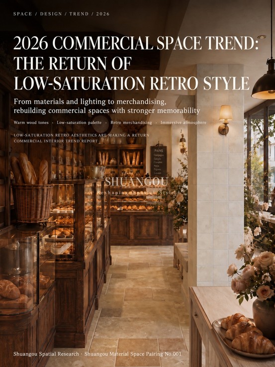
Over the past two years, more and more bakeries have begun shifting from “good for photos” to “good for staying.” In the past, many stores designed their spaces to feel instantly eye-catching: high-saturation colors, strongly styled decoration, and obvious social-media photo spots certainly made it easy to attract attention. But the problem was also clear—once the novelty faded, the space could easily start to feel noisy, cluttered, and short-lived. Now, however, consumers’ expectations of bakeries have changed. People are no longer coming only to buy bread, desserts, and coffee. They also hope to enter a space that feels relaxing, inviting, and warm. For this reason, low saturation, retro character, and natural materials are returning to bakery design and becoming a very clear trend for 2026. This style is not simply about making things look old, nor is it deliberately “imitating an old shop.” Instead, it creates a steadier and more memorable commercial atmosphere through materials, lighting, merchandising, and color relationships.
Why Is Low-Saturation Retro Style Becoming More and More Suitable for Bakeries?
Bakery spaces are different from many retail spaces—they naturally carry a sense of everyday life and warmth. Bread, desserts, wooden cabinets, aroma, and lighting are all elements that naturally pair well with a retro, low-saturation spatial character. Compared with designs that feel overly cold or overly trend-driven, low-saturation retro style makes customers feel more relaxed and better fits the business logic of a bakery: approachable for everyday visits and appealing enough for repeat return visits. From a branding perspective, this kind of space also has several clear advantages:
1. More enduring and less likely to go out of style
Low-saturation colors are more forgiving, create less visual pressure, and do not become outdated quickly simply because trends change too fast.
2. Better at building brand memory
A truly memorable space does not necessarily rely on dramatic forms. More often, it is built through a stable and unified material language. What customers remember may not be one particular decorative object, but the overall feeling: warm, natural, quiet, and textured.
3. Better suited to long-term operation
A bakery is not a one-time consumption setting—it depends on frequent repeat purchases. Compared with an “Instagrammable” space that is only good for one photo, a low-saturation retro space is better suited to lingering and more likely to improve the repeat-visit experience.
So the future trend of bakery spaces may no longer be to become more and more complicated, but rather more restrained and more focused on the spatial atmosphere created by the materials themselves.
In Retro Low-Saturation Bakery Spaces, the Core Is Not Decoration, but Material Relationships
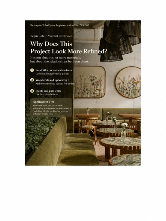
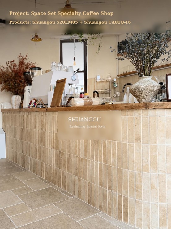
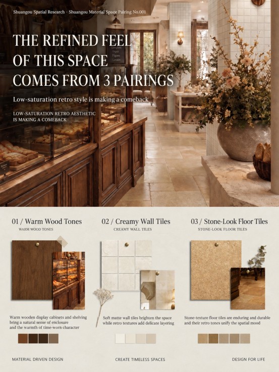
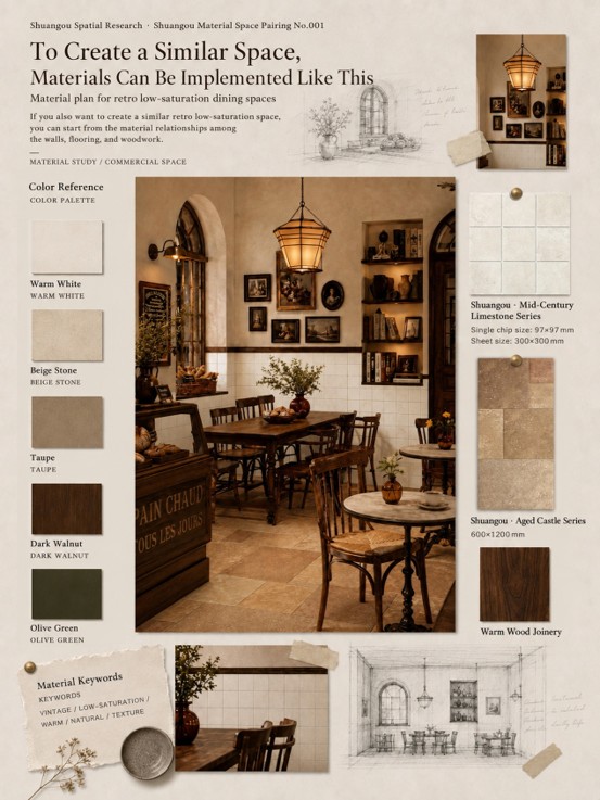
When many people think of retro style, they first think of pendant lamps, floral arrangements, old wooden furniture, and decorative paintings. These elements are certainly important. But if you rely only on soft furnishings to create atmosphere, the space can easily remain “superficially retro.” What truly determines spatial quality is still the relationship among the foundational materials—especially the walls, flooring, and woodwork. What makes this kind of bakery space feel refined is exactly this: The walls are responsible for delicacy and background, the floor is responsible for stability and support, and the woodwork is responsible for warmth and memory. And the pairing logic this time is actually very clear— Wall tiles: Shuangou Mid-Century Limestone; Floor tiles: Shuangou · Aged Castle Series. This combination is essentially using different material languages together to establish a retro, low-saturation space.
Why Are Shuangou Mid-Century Limestone Tiles Suitable for the Walls?
In a retro bakery space, the walls should ideally not be too attention-grabbing. They should not act as an overly dominant visual center. Instead, like a quiet background, they should hold up the light, furniture, and food display throughout the space. This is exactly where a material like Shuangou Mid-Century Limestone becomes highly appropriate. Its strength is not that it looks “busy,” but that it carries a natural, soft, and slightly time-worn texture. In color, it leans toward off-white, warm white, and light stone tones, which naturally fit the foundational palette of a low-saturation space. Once applied to the walls, it can deliver several very direct effects:
1. It increases the brightness of the space without feeling harsh
Many bakeries need a sense of warmth, but if everything is dark, the space can feel oppressive. A light-colored wall tile such as Mid-Century Limestone can lift the overall brightness while still retaining a warm, gentle feeling.
2. It adds layered detail
Compared with an ordinary latex-painted wall, tile inherently brings more order and more detail. Especially under lighting, the subtle texture on the wall creates layers in the space rather than leaving it flat.
3. It creates a more natural retro feeling
A truly refined retro atmosphere does not come from deliberately distressing everything. It comes from letting the material itself appear as though it holds the traces of time. The subtle and understated stone-like texture of Mid-Century Limestone allows the space to approach that feeling in a much more natural way. For bakeries, this kind of wall finish is especially suitable for: Dining-area feature walls; Wrapped columns; Side walls beside the counter; Backdrops for product display zones. It will not steal the spotlight, but it will make the overall character of the space feel more complete.
Why Does Shuangou · Aged Castle Series Work So Well on the Floor?
If the walls determine the “detail atmosphere,” then the floor determines the “spatial foundation.” In a retro low-saturation space, the floor cannot feel too light, nor can it feel too modern. It needs a certain sense of weight and stability in order to truly hold the woodwork, lighting, and soft furnishings together. Shuangou · Aged Castle Series is exactly the kind of flooring material that suits this type of space. The greatest feature of this floor tile is that it carries both a stone-like feel and a hint of retro character created by its aged finish. When installed in a bakery space, it does not feel too new or too cold, nor is it overly rough. Instead, it helps the whole space feel as if it has been lovingly operated for many years. Its value is mainly reflected on three levels:
1. It establishes a sense of stability in a retro space
Bakery interiors usually contain many wood tones and warm lights. If the floor is too light, the entire space can feel visually ungrounded; if the floor is too bright, it can weaken the retro atmosphere. Aged Castle Series, with its warm tone and stone-like character, helps anchor the overall mood beautifully.
2. It enriches the spatial layering without stealing the scene
It has natural texture and a low-saturation palette, so it adds quality to the space without becoming as visually aggressive as high-contrast textures. This is especially important for bakeries, where the product display still needs to stand out.
3. It is better suited to long-term use in commercial spaces
A bakery is a high-frequency operating environment, so the floor needs to be not only attractive, but also enduring and durable. Visually, Aged Castle Series is more forgiving. Even after long-term use, minor wear does not feel abrupt—in fact, it becomes more in tune with the spirit of a retro space. This is also why many commercial spaces in the future, especially those pursuing atmosphere and durability, will increasingly prefer this type of flooring expression: low-saturation, stone-like, and marked by a sense of time.
These Are Likely to Be the Major Future Trends in Retro Low-Saturation Bakery Spaces
Based on the current direction of commercial-space development, bakery design in the future is likely to become increasingly focused on the following trends:
1. From “Instagrammable appeal” to “lingering appeal”
Future bakery spaces will no longer exist only for taking photos—they will be designed to make consumers want to stay a little longer. They will place more emphasis on comfort, warmth, and experience, rather than simply chasing visual stimulation.
2. From “decorative accumulation” to “material expression”
In the past, style was often created through ornaments and decoration. In the future, the character of the space will be built more through foundational elements such as wall and floor materials, woodwork, and lighting. Truly refined spaces are often not achieved by adding more, but by making the relationships among materials work from the start.
3. From “a single attractive store” to “a replicable brand language”
Especially for chain brands, spaces increasingly need a replicable standard. Fixed wall-tile tones, floor vocabulary, and wood-tone systems—these material relationships will become an important part of future brand-space identity.
4. From “high-saturation impact” to “low-saturation endurance”
Low saturation does not mean boring. On the contrary, it means more layers and more room for adaptation. It can support product display, changes in soft furnishings, and seasonal updates, and it is more suitable for long-term operation.
Shuangou’s Spatial Pairing Philosophy: Not Only Supplying Materials, but Helping Materials Enter Space
This is also why Shuangou has never focused only on “what kind of tile to sell,” but more on this: Once a tile enters a space, can it truly form a coherent pairing relationship? Because for designers and brand owners, the hardest part has never been finding a single product, but rather: How can walls and floors be paired without feeling chaotic? How can a space have style without feeling oppressive? How can materials be used to create brand memory? What kinds of combinations can truly be implemented? These are exactly the questions Shuangou has been studying.
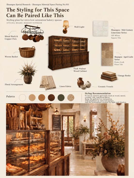
From global commercial-space trends, to the logic of material pairing in different scenarios, to specific methods of product combination, what Shuangou hopes to provide is a complete solution mindset: “from materials to space.” For example, in this kind of retro low-saturation bakery space: Use Shuangou Mid-Century Limestone on the walls to brighten, soften, and add a retro background quality; Use Shuangou · Aged Castle Series on the floor to stabilize the spatial tone and establish a stone-like feel and a sense of time; Then combine them with warm wood-tone cabinetry, brass wall lamps, ceramics, linen, floral arrangements, and other soft-furnishing elements; What ultimately takes shape is not just a display of two tile products, but a true spatial pairing language that can help designers bring a project to life. This is also the core of Shuangou’s spatial pairing philosophy: Materials do not exist independently—the relationship among materials is what determines the final refined quality of a space.
Great Future Bakery Spaces Will Surely Be Spaces That Make People Feel Comfortable
Future bakeries will not blindly pursue stronger design statements, but will increasingly value the relationship between people and space. When customers walk into a store, what they feel is not only the product, but the overall atmosphere: Whether the walls feel soft, Whether the floor feels stable, Whether the woodwork feels warm, Whether the lighting helps people relax. These seemingly small judgments will ultimately determine whether a store has memorability, repeat-purchase value, and lasting aesthetic vitality. The reason retro low-saturation spaces are worth being adopted by more and more brands is precisely that they have style without excess; emotion without sacrificing long-term operation; and they can both move consumers and help form a brand’s own spatial language. Shuangou believes that truly good materials are not just attractive—they help a space be remembered. From material research, to spatial expression, to implementation pairing, what Shuangou hopes to do is not merely provide products, but help designers and brand owners find spatial solutions that are better suited to current commercial trends.